Greetings, Hypertransitory readers. As you all know, I’m a comics guy and you’ve no doubt seen many if not all of my Monday Comics series. Regular readers will remember that I usually followed the comic with my working art and a “behind the scenes” write-up of the process of making the comic.
In today’s installment I’d like to take you guys behind the scenes in a different way than my usual posts. The different thing is that I didn’t make this comic. The only thing I had to do is add the lettering and my part was done.
Seemed like an easy job, but it turned out to be more involved than I thought! Read on for the sordid tale…
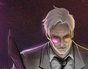
Ragnaroc, Inc: Embrace Oblivion #1

I know it seems a bit strange that I’d be working on someone else’s comic, especially doing the lettering of all things, so where’d this one come from anyway?
Well, this thing is actually created and written by none other than my own little brother Jason Garrett.
Here’s the blurb for the story:
“Embark on a hi-tech action adventure thrill ride with Ragnaroc Inc. As a second Big Bang explosion is set to consume the Earth in seven years, John “Lazarus” Thunderstarr and his space-time warping company Ragnaroc Inc are hired to find a solution to the impossible. However, John’s enemies are numerous and closing in. He must be protected at any cost.”
(Oh yeah, and my sister’s a writer, to boot, so this stuff runs in the family, I guess!)
To make the comic, he’d hired a crew to work on it for him, and most of it was what I considered to be top-tier work – except for the lettering.
He wanted to run the first pages by me so he sent over some hi-res files. The art was excellent, but I had an issue with the lettering. What I found when I checked out the files was that the text was quite jagged, or aliased.
Years of working in pre-press taught me to constantly be on the lookout for any errors like this that might cause you to waste film and thus waste money.
Check out the example below so you can get a feel for what I’m talking about:
BAD EXAMPLE:

GOOD EXAMPLE:

If you notice, in the bad example the text is much thicker and somewhat rough looking. The look of the text led me to believe that it was done in Photoshop, and without the use of anti-aliasing.
Anti-aliasing is a now ubiquitous technology that smooths out the edges of fonts so they don’t appear jaggy or “chewy” as we used to say.
Photoshop does have anti-aliasing features, but I suspect it was set to “none” in the original letterers’ program.
WHY I DISLIKE PHOTOSHOP FOR COMIC TEXT
While you can letter a comic in Photoshop, to me it’s not very efficient and can lead to problems.
For one thing each block of text generates its own new layer, and can quickly make your file unwieldy. It can also be difficult to select and move the text around. Not prohibitively so, but it’s not as easy as Illustrator and InDesign.
Another one of my pet peeves working with text in Photoshop: When I enter text in a block, I like to press the Escape key in order to quickly exit the text block and then get back to my Move tool so I can position the text where it needs to be.
This works fine in Illustrator and InDesign, but if you press the Escape key in Photoshop it will actually cancel your text entry – then whatever it was that you just typed is lost.
Instead you have to hit the Enter key to escape the text entry, and then you’ll still have the Text tool selected, so once you’ve actually escaped from the text box you’ll have to switch over to the Move tool as well.
I know this doesn’t seem like a big problem, but believe me years of muscle memory are hard to change. I even tried changing the Move tool keyboard shortcut to the Escape key, but no dice. The program won’t let you do this.
Also, adding the actual text balloons and caption boxes becomes another pain since each box/balloon will generate it’s own layer, which really clutters up that layers palette and adds more to the file size.
The worst part about doing the balloons and such in Photoshop is that the program doesn’t do a very good job of maintaining sharp points like square edges and dialogue balloon points.

You can see in the example above that the dialogue balloons end more in a rounded end than in a true point, such as in my revised example done in Illustrator.
You can get around this by using Photoshop’s vector shape masks, but to me it’s not worth the hassle, since Illustrator does vectors so much better – that’s what it’s meant for after all.
For those of you who already know what rasters and vectors are (or don’t care) skip past the yellow box below down to the next section. If you want to know more, then read on for my basic primer:
VECTOR (RASTER) PRIME
For now, some of you might be wondering what I mean when I keep saying “vector”. Adobe Illustrator is a Vector art program. When a piece of computer art is vector, that means it’s made up of mathematically generated points connected by lines and then (usually) filled in with color.
Additionally, when something in motion has a “vector”, that means it has an intentional direction. You control the direction of the lines between the points by using the handles attached to each point.

This may not seem like a big deal, but because the art is mathematically generated, that means it’s a bit abstract, it’s not final. You might hear people refer to vector art as “resolution independent” artwork. This is because vector art doesn’t have a resolution. This means I can create a 1 inch x 1 inch square in Illustrator, then enlarge that same square to 10 feet x 10 feet and not lose any quality at all.
This is why most logos are done in vector format. You’ll need the logo for your business cards but one day you might need it for a billboard, too. If it’s done in vector format then you’re good to go, you won’t lose any quality.
So that’s great, right? Not quite. Printers don’t exactly understand vector information, so the artwork has to be “rasterized” before it can be printed. Raster art is what Photoshop (mostly) does.
When you have a raster image, it’s made up of pixels (on screen) and dots (printed on paper). The problem with raster is one you’ve all seen before: However many dots you start out with, that’s pretty much all you get. Trying to enlarge will result in loss of quality as the pixels move farther apart. Reducing will yield better results but those pixels will usually be thrown out never to return should you change your mind and want to enlarge again.
At print time you have to turn your vector into a raster, in most cases using what they call a RIP (Rasterized Image Processor). You have to tell the RIP at what resolution you want your vector artwork to be converted.
This is where you take a real performance hit if not careful. A 10 foot square in Illustrator is indeed large, but it’s really only four points, connected by lines and filled in with a color. Converting that to a raster will mean that entire square has to be filled up with pixels. The higher the resolution, the more pixels, and something like that can bring many machines to a grinding halt.
THE RIGHT TOOL FOR THE JOB
So obviously, as we can see from my own comics, I do a lot of lettering. Each comic I’ve done has been lettered in Illustrator (except for Kid Hype: The Origin, which was done in InDesign – TIP: don’t letter your comic in InDesign), because it’s been generally more efficient to do it in there.
I say “generally” because it’s still not as efficient as I would like. More on this later.
For now, on to the things I like:
- Obviously as I discussed above, I can make truly square objects and bring those text balloons to a point in a much better looking manner.
- I can throw all my text onto one layer for better efficiency.
- Even more so, I can better control the direction of those darn balloon points
- I can enlarge and reduce text effects and boxes without worrying about losing quality.
- I can add perspective and warp effects without rasterizing the text or converting to outline
In general, I have more control over the text in a more efficient manner than in Photoshop so it only makes sense.
One of the only things I don’t like about lettering in Illustrator is the need to maintain a separate file for each page. Illustrator doesn’t really have long document functionality so you can’t have 100 pages and master pages and all that you get from a layout program like InDesign or QuarkXpress.
As mentioned above, I actually made my Kid Hype Origin story using InDesign. I figured, this is a multi-page document so I’ll use a layout program. Well it turned out to be more trouble than it was worth. At the time, InDesign’s vector art tools weren’t working up to the level of Illustrator. To be fair, it’s not meant to. Adobe would rather you buy Illustrator if you’re going to be doing extensive vector work.
So I learned my lesson with that and jumped over to Illustrator.
And just to throw this out there, you can have multiple pages of a sort in Illustrator by using the Multiple Artboards functionality now built into the program.
With this feature I could import every page onto it’s own separate artboard in one Illustrator file, layout the text on each, then export them all separately to my desired format.
The only problem with this is you’ll soon find your file size ballooning way beyond a convenient size. Depending on the power of your computer and available ram, it might not be a workable solution. So I find it better to just have one page per file, it’s much simpler that way.
LETTERING LIKE THE PROS

Ok, I’m not a pro letterer by any means, but I think I can see what these guys have to go through every month to get these books out there.
NO CONTROL
The very first issue I had was that I had NO control over the art. As you can imagine, being kind of a “one stop shop” I do everything there is to do in my comics.
In this case, the artwork was some highly detailed, cool-looking work, and the artist does it FAST. Those pages were coming quickly, and when I thought about having to draw the same things I cringed because as some of you know, I don’t really care for drawing backgrounds.
So I was very impressed with the style from the beginning, but I was even more impressed that he left plenty of space for the words. That’s a big part of being a comic artist. Yes, you’re mostly telling the story through the art, but you’ve gotta leave some space in there for people to yell out “AAARGH!” and also “NOOOOOOOOO!!”
Many times when I was making my own comics, I’d make a cool panel but disregard my own script. When it’s time to put in the letters, I’d realize that I actually had zero space to add my brilliant blathering. Sometimes I’d have to go back and re-draw or work some Photoshop magic. Failing that I would just change the script to something else.
In this case, it’s not my own art and I have zero authority to go and change someone else’s art to fit the letters in. This is what comic letterers go through all the time. You can’t just go back and say “tell them to change the art and/or script so I can fit these letters in.” They’ll probably just say “Make it work” and then hire someone else the next time.
Although, this was still a special case since the writer is my own brother. I did have to say a few times that some text was just not going to fit, so he was able to work with me on that level. I’d hate to be a letterer who gets a wall of text that somehow has to go into a small 2 inch panel and it’s due NOW.
(NON) STANDARD FONT SIZE
One thing I learned from my various efforts over the years was that there really is no standard font size for comics.
It makes sense when you think about it. These days you have so many different fonts and they’re all different sizes and shapes. What this means is that 12 point Helvetica is not going to be the same size as 12 point Impact. Two different fonts at the same point size may end up being taller or wider than one another. They may be close, or vary wildly -so it doesn’t make sense to specify a hard rule about font sizes.

As far as I’m concerned, my job was to make the text as legible as possible while leaving as much of the art as I could visible.
This didn’t always mean to make the text as big as possible within a certain space. It still had to remain consistent. If I came to a page where I couldn’t make it fit at its current size, I would bring the point size down. This would mean I’d have to go back through all the previous pages and bring the size down there as well.
Something like this could be a real pain in the ass, if not for an extremely useful feature found in most design programs called Character Styles.
CHARACTER, PARAGRAPH AND GRAPHIC STYLES
When I adjust my text and finally get the size, color and spacing set the way I want, I can save that set-up as a Character Style.
Let’s say I have regular character dialogue, then I have a different font/size/color for my captions, and even if some otherwordly or alien characters use their own specific font, setting up a Character Style for each one can be a lifesaver.
It’s extremely efficient. This way when I want to make sure all the character’s dialogue looks the same or all the caption text looks the same all I have to do is select my saved style to apply it to the text. It sure beats setting all the font attributes one by one in the Character palette.
All I have to do is set up the text the way I want just one time, then while it’s still selected I can go over to my Character Style palette and click the “Create new style” button at the bottom. The new style that’s created will automatically have all the settings of whichever text is currently selected, so you’ll need to select your new style (it doesn’t automatically apply to the text you’ve got selected, so this will do that) and double click it to rename it to something descriptive.
When you create your new style and select it, you may see a “+” sign next to it. This means that there are “local changes” applied to it (these can prevent the style from updating correctly). Don’t worry too much about this now, just double click the style and it will get rid of the local styles. Also, double clicking to rename the style while the text is selected will usually clear this, too.
The best feature of Character Styles is the ability to globally change the style everywhere it appears directly from the Character Style palette. This way if I want to bump up the point size I do it in one spot, then every text item that has that style assigned will be updated. Very cool!
Regarding Paragraph Styles: The main difference here is that you can set your paragraph level attributes like text alignment. Most of the comic dialogue and captions I do are centered, so technically I should use Paragraph Styles, since I can set that attribute in there as well as my character styles. I just got so used to using the Character Styles that I always jump to them instead. Not really a big deal but something you should be aware of.
Aside from the text itself, the balloon and/or caption box that it sits inside of can be efficiently created using styles, specifically Graphic Styles.
The premise is the same. Get your box set up with the color/stroke/transparency, etc. that you want, then open the Graphic Styles palette.
You can either click the “New Graphic Style” button at the bottom of the palette, or you can literally drag your box/balloon into the palette, then rename the style to something descriptive. This way when it’s time to make the same sort of box all you have to do is click the style to apply it.
KEEPING UP WITH ALL THE STYLES
The bad part about using these styles with Illustrator as opposed to InDesign is that the changes you make in the styles don’t apply themselves across the documents automatically. Meaning that if you change the styles on one page, you’ll have to actually do it with all the pages. When you have a 32 page comic it can be tedious.
The ordeal can be made slightly less onerous by using the “Load Character Styles…” function found in flyout menu on the Character Styles palette. If you’re using Paragraph Styles, select the “Load Paragraph Styles…” function on the Paragraph Styles palette. If you have both use the “Load All Styles…” item found on both menus.
You’ll then need to select the target Illustrator file that contains the styles. The prudent thing to do is to maintain a “style template” file strictly for all your styles and make sure to keep it updated with the correct styles whenever you change something.
Be aware that if your styles use specific colors those colors will have to be available in the file. If they aren’t you could see some inconsistency as Illustrator will need to replace the unavailable color with something else. You can keep all the colors available in your style template and import those colors using the Swatches palette flyout menu and choosing “Open Swatch Library>Other Library…”. You’ll then be asked to select the Illustrator file that contains your colors.
Maintaining all of these styles is much easier to do in InDesign, but I prefer the greater text control I get from Illustrator so that’s enough to keep me using it for now.
ROUGHING IN YOUR DIAMONDS
I’ve been reading comics since I could barely read. In fact, they played a huge part in my learning development as a child.
However, it’s funny how some things you just don’t notice, even though they’re in your face all the time.
In this instance what I’m getting at is that I never noticed that the text in the dialogue balloons mostly (ideally) forms a diamond shape in the balloon.

It only makes sense – you want to fill up the balloon in the most aesthetically pleasing manner you can. Most of the balloons are some sort of elliptical or oval shape. Unlike a square box, it’s not going to be easy to maintain a consistent margin within the balloon every time.
Depending on the amount of text necessary to fit it can be a problem. Even looking at the pros you can see that they don’t always pull it off. Sometimes the (lack of) available space makes it challenging.
So basically all you can do is try your best. As stated above there’s not really a standard font size, and if you come on the job and the font is chosen for you then you’ll just have to work with what you’ve got and do the best you can.
SOUND FX AND OTHER CRAZY TEXT

Since someone is always getting punched or things are exploding, I need to represent those sounds in a way that conveys meaning visually. Usually this means distorting or warping the text beyond what the font originally intended.
Between Photoshop, InDesign and Illustrator, I feel Illustrator gives you the best tools to do this.
While you can distort and transform text in Photoshop, the type needs to be rasterized (turned into an image instead of text) first, so you’ll have to duplicate the layer first if you want to save editable text. This can lead to a lot of extra layers, file size and confusion.
InDesign has some minor text effects, but not on the same level as Illustrator. To get the same look you’ll end up just going back to Illustrator anyway most of the time.
In Illustrator, I can have a line of editable text, apply the 3D filter to it so it has some perspective on it, then add some warp filters to bulge or arc the type. The best part is I can still edit the text afterward if I need to (check the video at the end of the post to see this in action).
The 3D features in Illustrator aren’t up to par with standalone commercial 3D apps, or even my personal fave, the Open Source Blender, but they are absolutely perfect for this kind of work.
WHERE TO GET FONTS

Comic book lettering pros from back in the day did all the lettering by hand. These days of course it’s much more efficient to use computer lettering since you can always edit and make positioning changes easier.
Although maybe some of the lettering “art” is lost, we can still have approximations of hand drawn letters by the comic book greats. This is possible since many of the pros have turned their own lettering style into a font.
Roll your own
You can do this by using a font creation program such as Fontographer. The basics are that you can scan in your own hand drawn letters or other art you’ve created in vector or raster format, then literally create each character, set the default spacing/leading upper/lowercase and all that.
I used it once to make a font for a client and it worked out very well. Although I suspect these pro comic fonts have a lot more work invested in their creation.
Commercial Fonts at Comicraft
As far as I can tell the premiere venue for purchasing these fonts is a website called Comicraft. I purchased my go-to font, the “Dave Gibbons” (co-Watchmen creator) from this site way back in the day in 2005/2006. I bought quite a few others from there too, but none that I use as much as that one.
For Ragnaroc, Inc., my brother had already purchased the “Jim Lee” font (specifically for this project, so I was able to use it without ponying up myself).
Free and pro fonts at Blambot.com
The fonts on Comicraft do tend to be a bit expensive for the average joe, so after a few rounds I decided to look elsewhere for some pro-level fonts. I made a great find in Blambot.com, a site owned and operated by a comics lettering pro named Nate Piekos.
The greatest thing about Blambot.com is the many, many free font offerings. Free doesn’t mean cheap in this case. These are pro-level fonts, but the free versions may come without the lowercase or bold or something to that effect. Many are all inclusive, but just free. I’ve used many of these fonts over the years, and they’ve really added a lot of quality to my work.
ALTERNATIVE TOOLS

CORELDRAW
So obviously not everyone is using Adobe Illustrator. The major competitor to Adobe’s offering is a program called CorelDRAW. It’s a little cheaper than Illustrator but you should be able to produce equivalent work and use the same fonts, etc.
I’m a Mac guy, and CorelDRAW isn’t available for the Mac so I haven’t used it that much over the years. If a client sent us a CorelDRAW file, we would open it to check it over, then export it out to Illustrator.
From what I’ve read, CorelDRAW actually had the edge on Illustrator for a while, and Adobe finally brought some of the latest features found in that program (and incorporated from the old Freehand program) into Illustrator.
When I used to work with a guy who was from India, he told me that Adobe is not as prominent over in Asia, and that CorelDRAW was the standard tool, with Illustrator being a distant second. I don’t know if that’s true or not, plus it was almost seven years ago so the situation may have changed by now.
INKSCAPE
Even though CorelDRAW is cheaper than Illustrator, you still might not have that kind of money to spend on it. Luckily there is a free alternative you can use. It’s an Open Source program called Inkscape.
I first became aware of Inkscape because it was mentioned all the time in the many Blender tutorials I would read and watch. People using Blender were already in the free Open Source mindset and many were unlikely to buy Illustrator. So Inkscape and the Photoshop alternative GIMP were always offered instead of the commercial programs.
Although I have tried Inkscape, I can’t say for certain that it can do all the things Illustrator does. I only did rudimentary work with the program just to take a stab at using it. As it stands, I have Illustrator and about 15 years of experience working with it so it doesn’t make sense for me to switch to something else.
The good thing is that if you’re on a budget there’s no reason you can’t download these programs and do some cool lettering yourself!
RAGNAROC, INC. – Where to download

So if you’re interested in checking out the first issue of Ragnaroc, Inc: Embrace Oblivion, to read the story, marvel at the art, or more importantly, check out my awesome lettering, then there’s great news, you can get the first issue FREE. Here’s a few links for you:
- RAGNAROC, INC. – Read for free online at Graphicly.net
- RAGNAROC, INC. – Kindle Edition
- RAGNAROC, INC. – iBookstore Edition
- RAGNAROC, INC. Facebook Page – keep up with the latest
THE WRAP UP
So that’s all I’ve got for this installment, my friends. I hope this sheds some light on some more of the comic creator trials and tribulations that must be dealt with in order to make a comic.
Below is a video with some brief examples of many of the issues I discussed above. Sorry about the aspect ratio. I keep screwing that up and some of the top and bottom are chopped off. Not enough to be a showstopper but it might be a minor annoyance. Aside from that let me know your impressions about the article or the comic below, I’d love to hear what you think!
Excellent article awesome graphics.
One day I’ll create a comic book out of some drawings I have your website is inspiring.
What about current event comics?
Hey Freedom! If you decide to ever make your comics there are some really great print-on-demand type sites you can use (like ka-blam.com or comixpress.com), so it’s pretty cost effective.
As for my own stuff, I’m more into super-heroes and sci-fi/fantasy than current events, unless you count me fighting Old Man Winter :P
Thanks for reading!
The new font made a huge difference and I can see why it was a lot more involved than expected.
Yeah it definitely isn’t as simple as you would think. Thanks for reading!
Hmm. Sounds interesting. I never knew how to change fonts on comic book even if i create a comic book online. Thanks by the way!
Hey Mika, that’s exactly why I wrote this up, I figured someone somewhere might be interested. Thanks for commenting!
Your welcome. I am very thankful on your site because it always helps me.
Wow, amazingly detailed post here, good work! It’s funny I should read this now as last night was doing a rough draft to pass to an artist, of a cartoon I wanted, and I was trying to do the speech bubbles in photoshop which as you say soon became a massive pain due to layers and generally being really fiddly!
Ha! That’s funny Lucy, “fiddly” is exactly what I should have put in the article lol.
I hope your artist isn’t doing the text in Photoshop, either. Thanks for reading and commenting!
It is really interesting to get an inner view from a working process of a professional comic book drawer, I am totally fascinated about the complexity of these artistic graphics. I thought it wasn’t complicated, but sometimes things aren’t as simple as they seems to be.
Thanks Marlene for dropping in and reading! I didn’t think it would be that complicated either, but I guess we both thought wrong lol
wow! I didn’t know lettering a comic book was this much work! I didn’t even notice that text in the balloons form a diamond shape, until now. I bet it’s also fun to come up with ways to make the text represent sounds. This is just an amazing work.
Hi Mary! thanks for commenting. Yeah I never thought much of it either until it was time to DO it lol.
You’re right, representing the sound effects is one of the most fun parts!
So it seems that people using Windows have the upper hand in lettering a comic book, if they are adept in both Adobe and Corel software. On another note, i prefer using the fonts from Blambot.
Hi Butch, yes in my opinion, when you have more choice in software it always a better deal. If you’re using Windows then you have one more option that might make or break your efficiency on the project.
I know people who use Corel swear by it so I can’t knock it.
And yes, the Blambot fonts are awesome!
Very interesting aricle, especially when you confront Photoshop with Illustrator.
I’m still trying to learn Illustrator but I think this is a very good read about vector art!
Keep on with the hard work, i cant wait to read more!
p.s. I agree with you when you say that muscle memory is hard to change, but in my opinion the way Photoshop handles the enter and escape key is perfect. You have one key to start a new line (enter), one key to close the text box (the other enter) and one key to discard the text (escape).
Hey thanks for the comment!
I think it depends on which one you got used to first. I was always used to the Illustrator way of entering text. It was so rare to me to put in text with Photoshop that I found it a bit alien.
At least you like it, though. Good enough for me lol!
Woah, that’s an extensive process! I had no idea it took that much work either. And I definitely think Photoshop skills come in handy when it comes to lettering a comic book.
Hi CV,
yes Photoshop skills are always handy, indeed. Although in this case I would only use it to letter if absolutely necessary. It can be done on a professional level, I just prefer to use Illustrator.
Thanks much for dropping in and commenting!
I am not that good in comic books but I love reading them.. I can say that I have read a lot of comics and this one looks really interesting.. Thanks!
Hi Megan, thank you for commenting!
comic sip brother
Er, thanks Yadik! I think lol…
Really interesting! I have also used Illustrator for a few works, but I wouldn’t picture myself that it could be used for lettering a whole comic book as well. I bet that Quark could do that, I mean the multipage editing and the flexible vector graphics tools.
Hey Milena, you definitely *could* letter the comic in Quark and it would still look professional.
I haven’t used a lot of Quark in the last few years, so I’m not sure what level of vector editing they have in there, but between Illustrator and InDesign, Illustrator has finer control of the objects, so I prefer using that.
Let me know if you ever decide to give it a shot!
Sounds interesting. I never knew how to change fonts on comic book even if i create a comic book online. Thanks by the way!
You have inspired me to turn my website into comic kinda interaction. I will try it out and invite you to have a look. Thanks for an inspiration :)
I can see some of the shortcomings of PhotoShop. It’s so popular that I myself get hooked on it. So thank you for pointing this (thick letters) out.
Yes Photoshop is so ubiquitous that people tend to use it for everything. Whereas people really arent’t hat familiar with what Illustrator does.
I’m glad I showed you something new. Thanks for commenting!
I had no idea that you could use illustrator for comics. Its amazing. As you mentioned text really does matter. Its such a big difference. The bold version its hard on the eyes and tiring. Great post. Keep up the good work.
Hi Mike, a lot of people out there never considered Illustrator. It’s kind of up to Adobe to make sure people know exactly what Illustrator is good for. Judging by the reaction I get sometimes, they haven’t done a great job with that over the years.
Thanks for reading!
I’m making a comic strips. I think you are great artist. Your comic so nice. I couldn’t make a 3d comic like you did