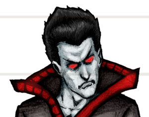

Here’s a character design of one of the bad guys from my webcomic The Ever Zone, Vizron the Litch-Lord.
A quick character summary: Vizron is an undead creature known as a Litch. A Litch is like an upgraded vampire -stronger and more powerful, without weakness to sun or wooden stakes. Instead of feeding on blood they feed on human soul energy -preferably after the human has been tortured to the brink of death.
Vizron is a Litch-Lord, a middle-ranking Litch in the service of his Master, Ergochann. Ergochann is possibly the first, and inarguably the most powerful Litch in existence. Vizron and other Litches of his rank are tasked with journeying through different dimensions, fomenting chaos and preparing the way for Ergochann’s coming, where he enslaves all sentient beings, basically reduces them to livestock and harvest’s their soul energy.
But to what purpose?
Anyway, so that’s the story, on with the art.
Normally when I create a comic, I do everything -from writing, penciling, inking to coloring, lettering and allthat. So I obviously know everything there is to know about my own characters.
Recently though, I had to step in on a comic project where the artist hadn’t done a character design sheet such as you see here. It made me realize how difficult things can become when you don’t start out with the basics.
The artist had drawn (most of) the comic, but there were no colors called out, and there were hardly any full-on body shots of the characters so you could see what the costumes looked like from all angles.
This made it pretty difficult to step in and hit the ground running. Instead, you have to keep paging through to try to find a panel that shows the character from the angle you need. If it’s not in there, then you have to make it up, which most artists are fully capable of, but you shouldn’t need to do this.
Even more trouble was that the artist & writer had never sat down and fleshed out the colors of the costumes. I wasn’t the colorist on this job but they asked me if I could color in the cover (which featured all the characters) and then send it on to the colorist they’d commissioned.
Well, no problem, except I had no idea what colors they were supposed to be, or who each character was in the first place. We got it done with a lot of back & forth but much time was wasted and that could have been avoided with better preparation from the start.
Coming off that job, I thought that just in case I ever hired an artist to do something for me I wouldn’t want them to go through that. So with this in mind I decided to make up character sheets for all the comics and other such art that I’ve done so far, starting with Vizron.
As an undead creature, I wanted Vizron to be dressed in some very drab grays, with only the red splash of color from his eyes and his suit trim. The rest of his outfit is lifeless, just like him.
If you take a look at the image, you’ll probably notice a bit of roughness to the art. The Ever Zone is a comic that I color right over the top of the pencil art. I don’t use any ink on it because I like the illustrative feel of pencils and the nuance you can get with pencil, as opposed to the stark black & white of ink -at least for this project.
This makes things harder and easier at the same time. Because there’s a lot of pencil smudging and softer edges, selecting the areas to color in Photoshop becomes a lot more manual. About 95% of the time, using Color Range or Magic Wand won’t get you the selection you want, so you’ll be forced to manually trace around using the lasso or pen tool. Some areas you can “paint in” using Quick Mask mode but it’s far more time consuming that if you had a clean line-art scan.
This pays off in the coloring stage, however. Since I add a lot of shading values with the pencil (I always start with blue pencil, then work my way up from 6H, to 2B, to 6B) I can rely on that to supply the modeling or shaping of the character, instead of having to do it all with the color.
I still use the color to add in highlights or fill in black areas, but not as much as I would have to if I had a line-art scan. You can see what the art looks like with only the flat color applied below.

The notations in the yellow boxes are for the colorist, so they know what exact colors to use for the character. The numbers are for the CMYK values that they’ll need in Photoshop to come up with that exact color. That way when it’s printed there won’t be any surprises.
I actually color everything in RGB, though, because it’s going to the web, but it must be the old prepress technician in me that always thinks in CMYK.
Also, I very rarely work in spot colors. Spot colors are proprietary inks that are usually more vivid and rich than what you can get with just plain old CMYK. The problem with using these is that it makes things unnecessarily complicated.
1. The first thing is that each spot color you use represents a different plate on the printing press. Most commercial offset presses will have room for about 8 plates.
It starts getting pretty expensive the more plates you use, plus the spot color inks are more expensive, so you’ll be charged more for using them. The regular four CMYK plates will be far less expensive -for less punchy, less vivid color, of course, but truly not many people can tell (probably only other designers/prepress operators).
2. You may have heard the term color separations before. When you hear that, it means spot colors. When using CMYK, the colors blend together to make up all the colors you see on the page. they literally print right on top of each other.
Spot colors can’t do that. They don’t blend together because they’re already blended in the lab at Pantone or Toyo or somewhere. They have to be kept separate from each other, hence the term “color separations”.
This isn’t as easy as you would think. When color separating, you end up dealing with an issue called trapping. Trapping deals with colors the butt-fit right up against one another. So if Superman’s red cape is up against his blue arm, the two colors can’t blend together, they have to meet exactly right up against one another.
You can do that in Photoshop, but remember each color is getting it’s own plate, and sometimes the plate shifts when on the printing press. To account for this, they prepress techs have to “trap” the colors together, usually by forcing the lighter color under the darker color. Depending on which way it goes this is called a spread or a choke.
As you can tell, this is a lot of work, and you will be charged a ton for all the time it takes to adjust for spot colors. Plus if you think of all the colors in a normal comic, it’s not even really possible. Maybe for the cover or for logos and such, but it’s just best to avoid them.
I know these days there’s in-rip trapping and such but you’d still have to go back and check it over very carefully to make sure you got the right traps in every panel.
3. Spot colors in Photoshop are a pain in the ass, anyway. It’s a lot of needless hassle to deal with spot colors in Photoshop. It doesn’t need to be that way, though, but I don’t think it’s high on Adobe’s list of items to fix.
Truly the spot color situation is one of the few things that’s horribly wrong with it. Between getting the color-naming right between applications and dealing with the channels and such it just sucks.
I don’t think I’ve ever seen any design that used spot colors in Photoshop where it was really necessary, or truly added much to the overall design. If you need spots, use Illustrator, it really excels at that sort of thing.
Anyway, so that’s my spot color rant for now.
I’d picked up a book a few years ago from DC comics, called DC Comics Guide to Coloring and Lettering Comics. The author actually used a black channel on the top of the regular CMYK channels, he added an extra 2px or so to the linework for trapping purposes. Check that book out if you’re interested in more on that process.
I normally don’t use channels, though. I’m a layers guy :)
I’ll just wrap up here by showing a pic of the raw pencil that I used for this drawing.

Again, since I don’t ink on this one, I’m forced to scan in rgb color at 300dpi, which yields a pretty decent size file at 11″ x 14″. If I were just scanning line-art I’d probably scan at least at 1200dpi, probably up to 2400dpi.
So that’s a small peek at my process for now. Stay tuned for more characters as I get around to them. Just let me know if you have any questions or comments in the comment section.

Awesome Litch. I definitely appreciate the penciled-roughness of your design. And I like that you conceive a story-line before initiating the sketch. When you do that, you can express the characterization that you want to convey. I could take a few pointers from you.
Thanks for sharing!
Hey thanks so much for he compliment! I’m glad you liked it, I had fun with this one.
great one